MEAL-PLANNING APP · PRODUCT UX AUDIT

When value shows up too late:

When value shows up too late:

redesigning the path to trial conversion

redesigning the path to trial conversion

A conversion-focused audit of a meal-planning app’s first-time experience -
identifying why users answered onboarding questions but dropped before commitment, and reshaping the flow to reveal personalized value before sign-up and paywall.

The challenge

The product had a useful promise: helping users discover recipes, personalize meal plans, and simplify grocery shopping.


But the first-time experience wasn’t helping users feel that value early enough.

The onboarding asked relevant questions around goals, dietary preferences, allergies, foods to avoid, and meal choices. Structurally, the flow made sense. But the experience moved users toward sign-up, trial, and paywall before they had a strong sense of what their answers were creating.

The audit focused on one question:

Are users experiencing enough value before they’re asked to sign up or pay?

Current onboarding flow
The app collected useful preferences, but the value payoff appeared only after users were asked to sign up or start a trial.

The core diagnosis

The onboarding was doing a lot of asking, but not enough showing.

For a meal-planning app, personalization only becomes meaningful when users can see how their answers shape the result.

If users choose their goals, diets, allergies, and preferred meals, they should quickly feel:

Are users experiencing enough value before they’re asked to sign up or pay?

Before: Users answered questions, then hit sign-up/paywall before seeing enough payoff.


After: Users see motivation, preferences, plan preview, and grocery value before the trial ask.


Analysis

What the funnel revealed

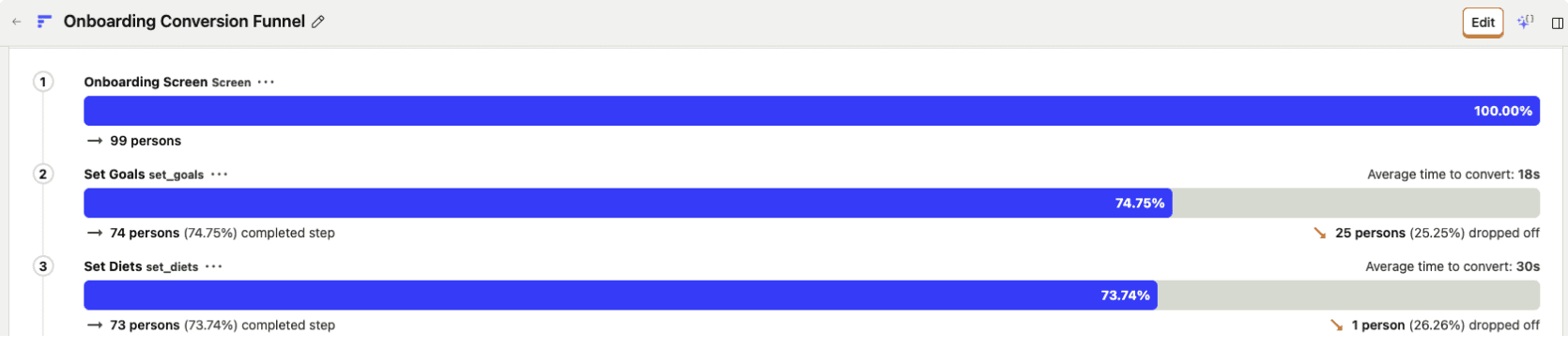
The data showed that users were not rejecting the app immediately. They were moving through the onboarding and answering questions.

The bigger issue appeared when the product asked for commitment.

Three signals stood out:

100% → 74.75% on the first screen

The opening screen didn’t give users a strong enough reason to continue.

58.59% → 40.4% from meal personalization to sign-up

Users were willing to personalize, but hesitated when asked to create an account

2.02% subscription

The paywall appeared before enough perceived value was built

The takeaway was clear:


Users were willing to give input.
They were not yet convinced enough to commit
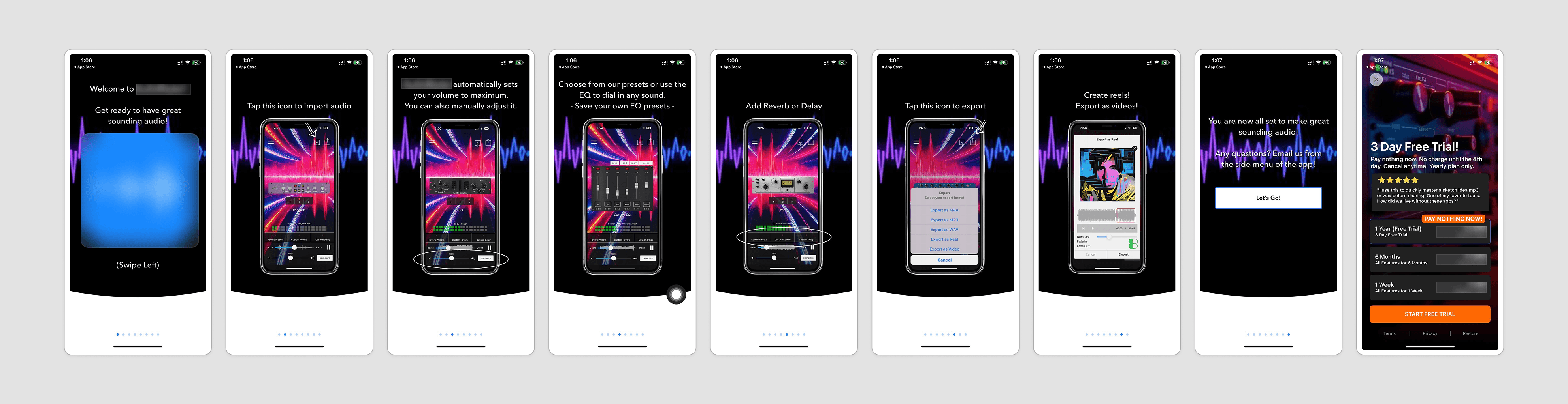
Current app
The existing product had useful features, but the experience needed stronger structure and clearer direction.
Strategic direction

Help users feel progress before asking for commitment

The recommendation was not simply to shorten the flow or redesign the UI.

The deeper opportunity was to change the order of value.

Instead of moving from questions directly into sign-up and paywall, the new flow needed to create a stronger value moment first:

Answer questions → See plan preview → Understand grocery value → Then commit

Why this shift matters

Value appears earlier

Users see what their answers are creating before they are asked to continue.

Commitment follows payoff

Sign-up and trial feel more natural once users understand what they’re saving or unlocking.

The paywall feels earned

The ask comes after the product has created a clearer reason to pay.

Expected impact

This recommendation was designed to improve the first-time experience by helping users reach the paywall with stronger intent.

Clearer onboarding motivation

  • Stronger perceived personalization

  • Less friction before sign-up

  • Better trial readiness

  • A clearer weekly habit loop


The audit reframed the problem from:

Users are not converting.

to:

Users are not seeing enough value before being asked to commit.

That shift changed the recommendation.

The goal was not to push users faster toward the paywall. It was to help them arrive there with more confidence, more context, and a clearer understanding of what the product could do for them.


Translating the strategy into the new onboarding flow

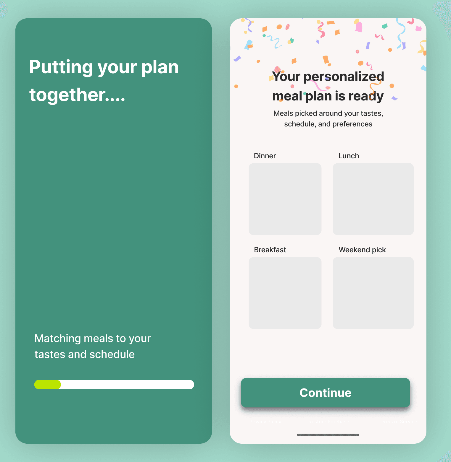
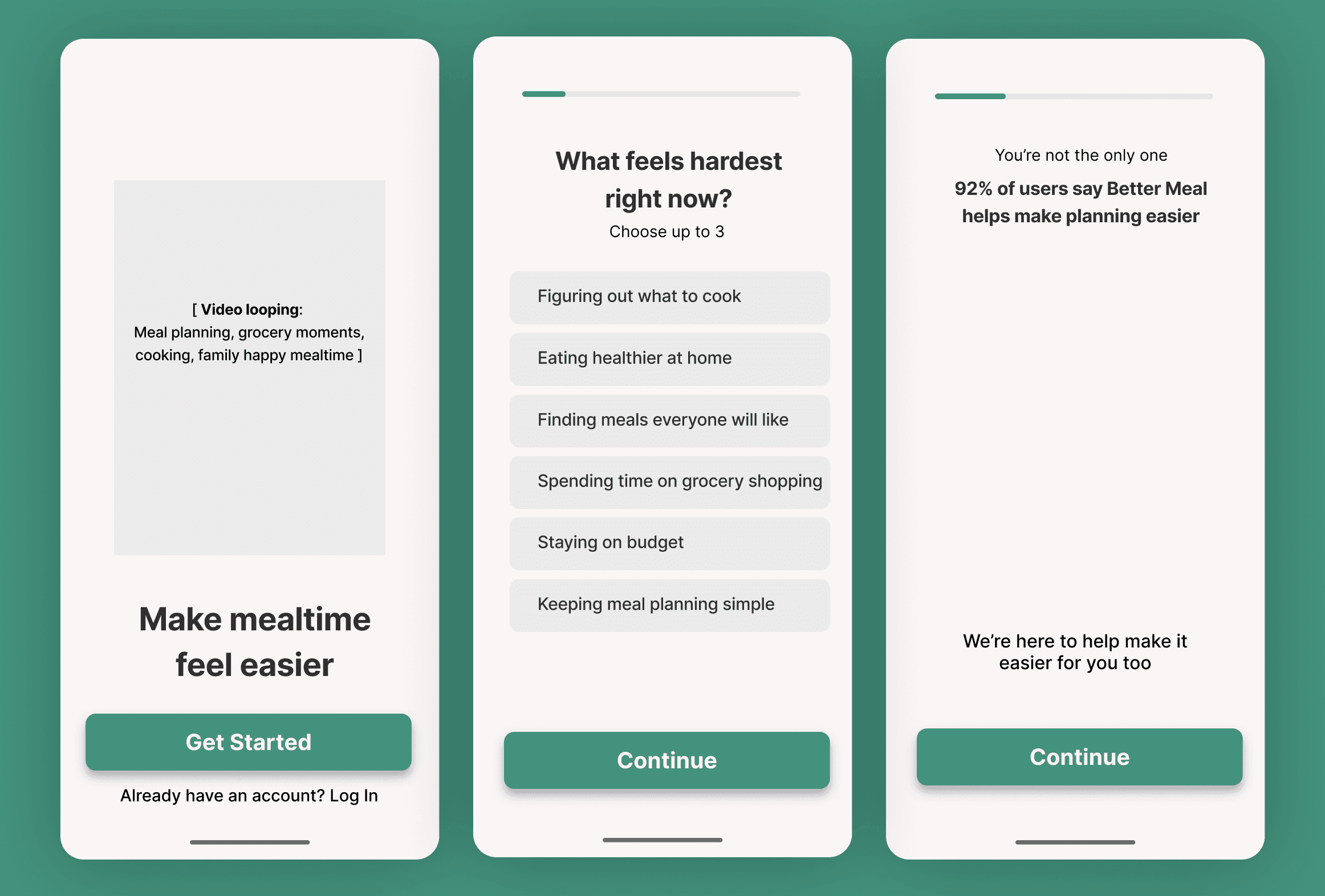
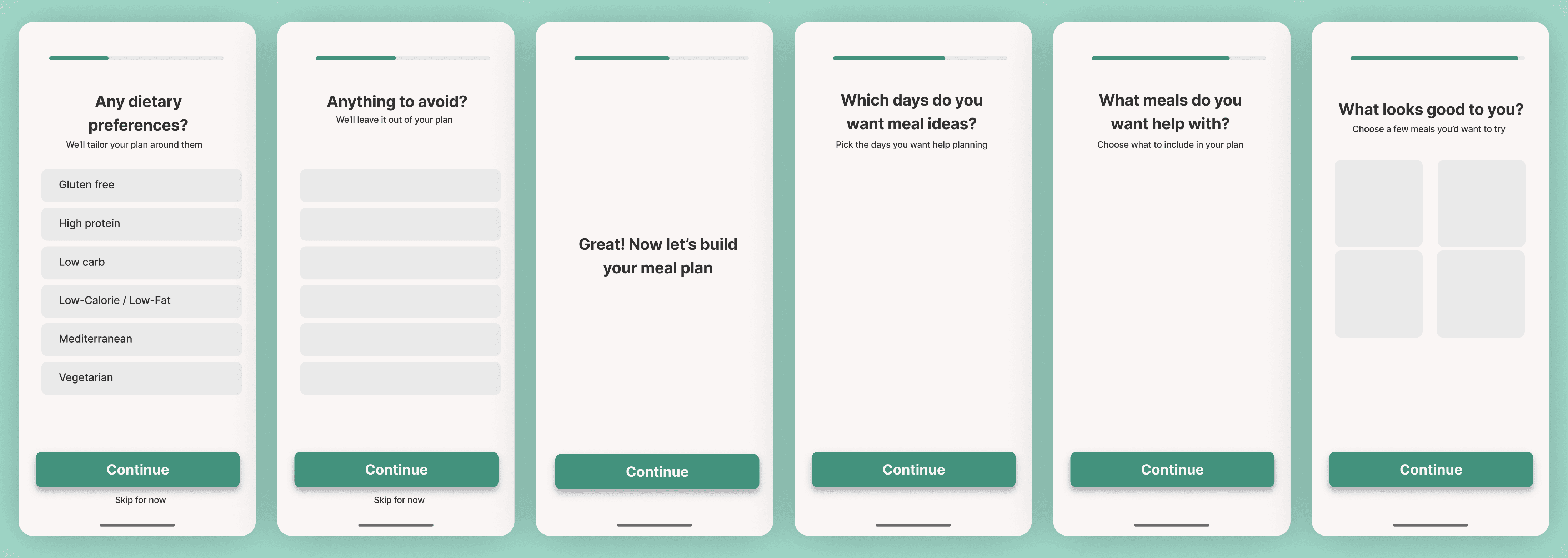
The proposed onboarding flow was designed to make users feel progress before asking for commitment.

The proposed onboarding flow was designed to move users from intent to perceived value before asking for commitment.

Instead of treating onboarding as a set of questions, the new flow creates a clearer journey:

Hook → Intent → Preferences → Plan building → Meal plan preview → Grocery value → Trial / Paywall

1. Hook the user early

The flow starts with clearer value messaging instead of a generic welcome.

Make mealtime feel easier gives users a simple reason to continue - less decision fatigue, easier planning, and a faster path to meals that fit their life.

  1. Make preferences feel purposeful

The app still asks about goals, diets, allergies, foods to avoid, and meal choices. But now these steps are framed as inputs that shape the final plan.

This makes the user feel:

My answers are helping build something useful.

  1. Reveal the plan before asking for commitment

The key change is showing value before the paywall.

A personalized meal plan preview gives users a clear “aha” moment. It turns the onboarding from a form into a product experience.


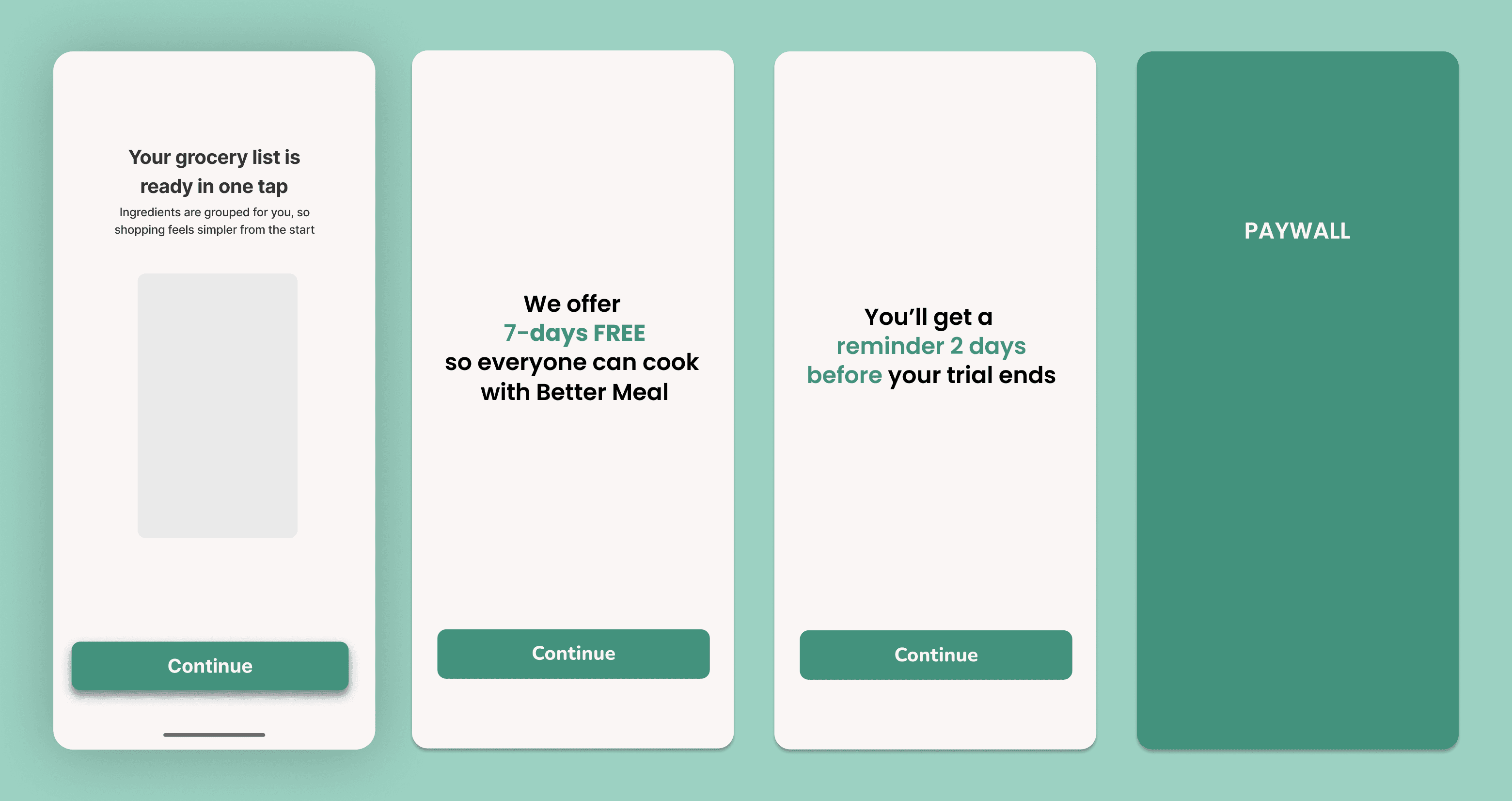
  1. Introduce grocery value as the practical payoff

The grocery list preview strengthens the product’s usefulness beyond recipe discovery.

The message becomes:

Your grocery list is ready in one tap.

This helps users see the app as something that supports the full meal-planning workflow, from deciding what to eat to shopping for it.

  1. Ask for trial after value is clear

Once users understand what the app is building for them, the trial/paywall feels better timed.

The ask is no longer attached to an abstract promise. It follows a clear payoff.

Confidentiality note

This case study is based on work completed as part of a contract engagement. Client branding, sensitive visuals, and analytics details have been anonymized or recreated where needed.

The core diagnosis

The onboarding was doing a lot of asking, but not enough showing.

For a meal-planning app, personalization only becomes meaningful when users can see how their answers shape the result.

If users choose their goals, diets, allergies, and preferred meals, they should quickly feel:

This is being built around me.

Without that feedback, onboarding starts to feel like effort.
With that feedback, it starts to feel like progress.

This became the foundation of the recommendation.

The redesigned flow changed the order of value.


Before: Users answered questions, then hit sign-up/paywall before seeing enough payoff.


After: Users see motivation, preferences, plan preview, and grocery value before the trial ask.


Strategic direction

Help users feel progress before asking for commitment

The recommendation was not simply to shorten the flow or redesign the UI.

The deeper opportunity was to change the order of value.

Instead of moving from questions directly into sign-up and paywall, the new flow needed to create a stronger value moment first:

Answer questions → See plan preview → Understand grocery value → Then commit

Why this shift matters

Value appears earlier

Users see what their answers are creating before they are asked to continue.

Commitment follows payoff

Sign-up and trial feel more natural once users understand what they’re saving or unlocking.

The paywall feels earned

The ask comes after the product has created a clearer reason to pay.

Translating the strategy into the new onboarding flow

The proposed onboarding flow was designed to make users feel progress before asking for commitment.

The proposed onboarding flow was designed to move users from intent to perceived value before asking for commitment.

Instead of treating onboarding as a set of questions, the new flow creates a clearer journey:

Hook → Intent → Preferences → Plan building → Meal plan preview → Grocery value → Trial / Paywall

1. Hook the user early

The flow starts with clearer value messaging instead of a generic welcome.

Make mealtime feel easier gives users a simple reason to continue - less decision fatigue, easier planning, and a faster path to meals that fit their life.

  1. Make preferences feel purposeful

The app still asks about goals, diets, allergies, foods to avoid, and meal choices. But now these steps are framed as inputs that shape the final plan.

This makes the user feel:

My answers are helping build something useful.

  1. Reveal the plan before asking for commitment

The key change is showing value before the paywall.

A personalized meal plan preview gives users a clear “aha” moment. It turns the onboarding from a form into a product experience.


  1. Introduce grocery value as the practical payoff

The grocery list preview strengthens the product’s usefulness beyond recipe discovery.

The message becomes:

Your grocery list is ready in one tap.

This helps users see the app as something that supports the full meal-planning workflow, from deciding what to eat to shopping for it.

  1. Ask for trial after value is clear

Once users understand what the app is building for them, the trial/paywall feels better timed.

The ask is no longer attached to an abstract promise. It follows a clear payoff.

Expected impact

This recommendation was designed to improve the first-time experience by helping users reach the paywall with stronger intent.

Clearer onboarding motivation

  • Stronger perceived personalization

  • Less friction before sign-up

  • Better trial readiness

  • A clearer weekly habit loop


The audit reframed the problem from:

Users are not converting.

to:

Users are not seeing enough value before being asked to commit.

That shift changed the recommendation.

The goal was not to push users faster toward the paywall. It was to help them arrive there with more confidence, more context, and a clearer understanding of what the product could do for them.


Confidentiality note

This case study is based on work completed as part of a contract engagement. Client branding, sensitive visuals, and analytics details have been anonymized or recreated where needed.

Contact

Ready to

Ready to

improve the flow?

improve the flow?

Bring the app, website, or flow you’re trying to improve. I’ll help you understand whether you need a focused review, UX/UI execution, or a larger product engagement.

Book a discovery call

No pressure. Just a quick conversation to understand what’s blocking progress.


Prefer to send context first?

Share what you’re building, improving, or trying to figure out.


© 2026 Fix My App. All rights reserved.

© 2026 Fix My App. All rights reserved.

© 2026 Fix My App. All rights reserved.

© 2026 Fix My App. All rights reserved.