Help users feel value faster, give them reasons to return, then make premium feel worth it.
The outcome
The app grew into a $121K+ subscription product after the product experience was rebuilt
Proof snapshot
Users were showing up, but not staying long enough to build habit or revenue.

The core problem
People opened the app, but didn’t have enough reason to come back.

Strategy
Activation → Engagement → Retention → Monetization
The thinking behind the redesign
Day 1: immediate value
Day 2 onwards: Habit formation

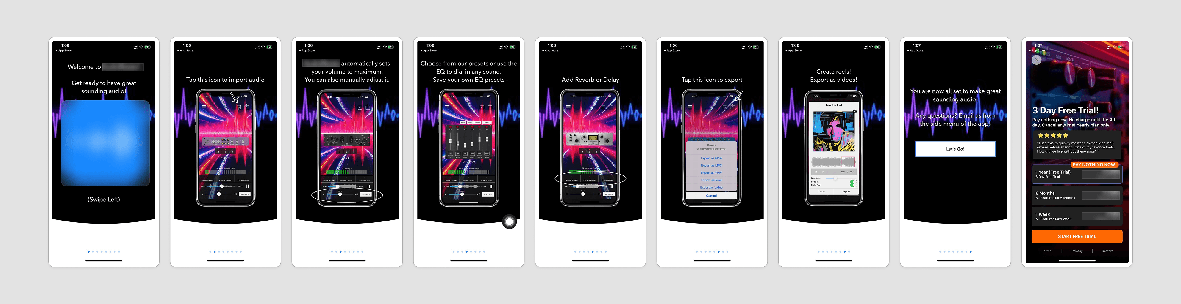
Onboarding
Build trust before asking for habit.
Frequency-based wellness can feel abstract.
So the first-time experience needed to do more than introduce the app. It had to help users understand what sound frequencies can support :focus, sleep, relaxation, calm, meditation, or emotional balance.
The onboarding was designed to do three jobs:
Build trust
Explain the value of sound-based wellness in a simple way.
Capture intent
Understand what the user wants support with.
Shape the experience
Use that intent to guide the homepage, recommendations, playlists, and premium messaging.
The goal was not to ask questions for the sake of personalization.
It was to make the first session feel more relevant.

Homepage redesign
Make the homepage a reason to return.

The product needed more depth.
The redesign added product moments that gave users more reasons to explore and return.

Testing mindset
After the first redesigned onboarding went live, I mapped the next optimization path.
The first version was only the starting point.
I also prepared a phased testing plan to explore stronger hooks, shorter flows, clearer premium comparison, and softer upsell moments — using competitor patterns and app references as inspiration.
Not all of this launched before the product was sold, so I’m not treating it as part of the outcome.
But the goal was clear:
Planned tests included:
Stronger hook
Test a clearer first impression.
Shorter flow
Remove weak education and reduce friction.
Premium comparison
Show why upgrade matters before the paywall.
Softer upsell
Test reminder, banner, and rescue offers.
Monetization validation
The monetization work was tested in phases, not changed all at once.
One live RevenueCat experiment tested what to keep and what to remove before the paywall.
Variant B introduced two changes:
Personalized outcome message
A message based on the user’s selected goal, like sleep, focus, stress relief, meditation, or recovery.
Reminder selection
A step where users chose when they wanted to be reminded before the trial ended.


Outcome
The app eventually reached $121K+ in subscription revenue.
Average engagement also improved from around 1m 33s to 8m+.
The outcome came from strengthening the whole product journey:
Clearer onboarding
More useful homepage
Deeper feature set
Stronger retention loops
Validated monetization experiments

The redesign helped turn an app with existing traffic but weak product pull into a stronger subscription experience with higher engagement, clearer premium value, and stronger in revenue.